1. Psychology of color.
Color is the experience of the "observer." Each color has its own impact on our well-being. It is also A powerful tool in shaping your brand . Although the effect that colors have on our emotions varies from person to person depending on gender, culture, personal experiences, and neurological differences, there are some general guidelines that have been validated by countless studies in color psychology.
Meanings of colors:
Red : passion, attention, importance
Yellow : self-confidence, optimism, tenderness
Celery :freedom, calmness, calmness
Blue: security, stability, formality
Purple :dignity, luxury, spirituality
However, the meaning of colors alone is not enough. Another challenge is...
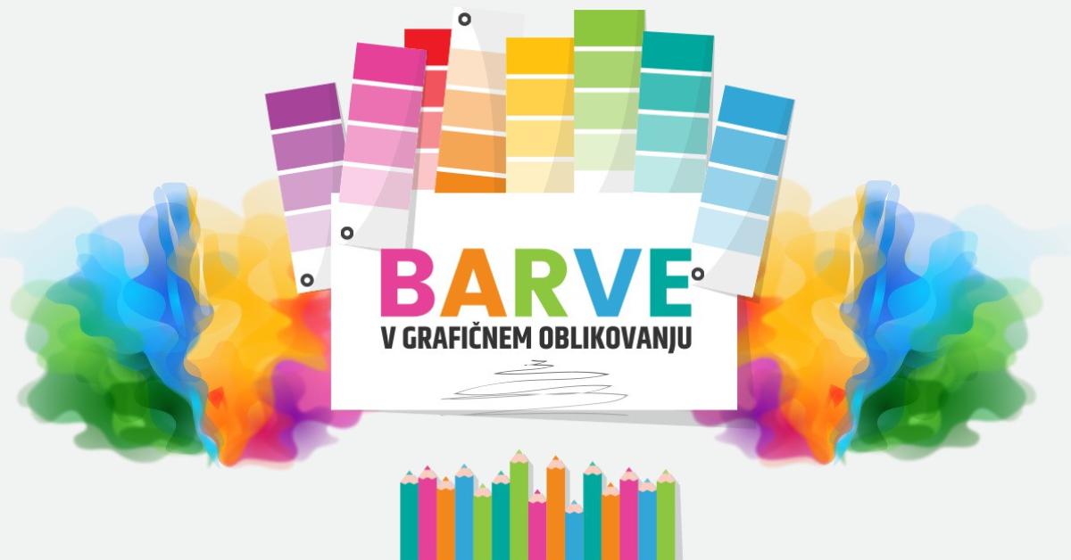
2. The correct color combination
A very useful tool is Color Wheel , i.e. a graphical model showing how successive colors are formed and what their relationships are between them. Complementary colors lie opposite each other, the combination of which gives a strong contrast, for example, dark blue and yellow. Harmonious colors are close to each other, and all their attributes are similar, that is, they have a similar Hue, value and colour . What do these three terms mean, with which we can quite accurately denote color?
- The shade not only names the color, but also determines its temperature, that is, a higher content of yellow (warm color) or blue (cold color). Each color can have its own warmer or cooler shade. Let's take peas and emerald green as an example - they are completely different.
- The value determines the intensity of the color, that is, how close it is to black or white. Pastel pink is therefore light in color, and burgundy is dark in color.
- The last attribute is chromaticity, that is, purity and clarity, which is reduced with the addition of gray. The color then seems dull and much more subdued. Neutral colors are white, all gray and black.
3. Color according to your target audience
Who's yours Target group ? What is their personality? Roughly, the target audience can be divided into extremes: serious - playful, youthful - mature, modern - traditional, feminine - masculine, luxurious - cheap.
Once the people are defined, we can also divide the colors according to them. It has been proven that younger people are more attracted to bright and vivid colors, while older people are more attracted to subdued colors. Warm colors are more energetic and stimulating to action, while cool colors are soothing and soothing.
4. Colors in culture
The importance of colors in culture It can't be ignored. In Finland, for example, the combination of blue and white implies quality and homeliness. The religious, political, and social significance of colors is also noteworthy.
Colors also include common arrangements that are used as color signals, such as traffic signs, e.g., red - warning, blue - guidance, or are associated with their seasons, e.g., red - Christmas, orange - Halloween.
Don't worry if your competitors have the same colors as you. There are many brands that use red and yellow for example – McDonald's, Hungry Jacks, Vegemite, Pizza Hut and Superman. McDonald's and Hungry Jacks are direct competitors. That doesn't bother them.
Choosing colors with the right parameters has a big impact on the effectiveness of your ad or your brand.
With our knowledge of the psychology of color and our experience, we will make sure that your brand, website or other printed matter perfectly meets the taste of customers.
Good graphic design is half of the work done and our team will take care of a fresh approach to marketing communication.
Want to know more?